Architect of the Capitol
Architect of the Capitol (AOC)
• website redesign
• collaborative design
• information architecture
• wireframing in Sketch
• prototyping in InVision
overview
clienT
Serving Congress and the Supreme Court, the Architect of the Capitol (AOC) is the builder and steward of the landmark buildings and grounds of Capitol Hill. Their staff preserves and maintains the historic buildings, monuments, art and inspirational gardens on the Capitol campus.
the challenge
In spite of all the beautiful buildings, grounds, statues and paintings they care for, the Architect of the Capitol’s website was unattractive and outdated. It overused image cards for navigation. Links in the utility nav and footer took users away to related sites without giving them a reason to stay and explore. Though they were producing strong serial content, users were not finding it.
the solution
The reimagined website tells the compelling story of the Architect of the Capitol, its staff and the work they do with clean, appealing design and engaging writing. The site showcases the art, architectural elements, historic buildings and beautifully landscaped grounds. A new information architecture and on-page hierarchy make navigation more intuitive. Improved use of taxonomy surfaces related material, encouraging visitors to continue exploring.
the process
When I joined this project, discovery findings and initial IA recommendations had already been made. I worked with the content strategist to continue refining the sitemap and taxonomy. We conducted card sorts to ensure that art and architectural elements were labeled and grouped in ways that made sense to non-experts.
To kick off the design process, I facilitated a design studio with the client to determine content and priorities for pages and sketch initial designs. During the project, I wireframed 14 pages, many with alternate views. To generate ideas, I led internal sketch sessions with the team. I then presented my draft wireframes to the internal team for critique and to ensure that designs were feasible. Finally, I presented wireframes to the client and revised according to their feedback.
As the site was built, I worked with the development team to ensure that designs were built as intended. The clients were thrilled with the results and are considering follow-on work.
the designs
Landing pages—Before
Landing pages lacked text, meaning AOC was missing an opportunity to give context to visitors. Image cards were over-used throughout the site to link to child pages.
After
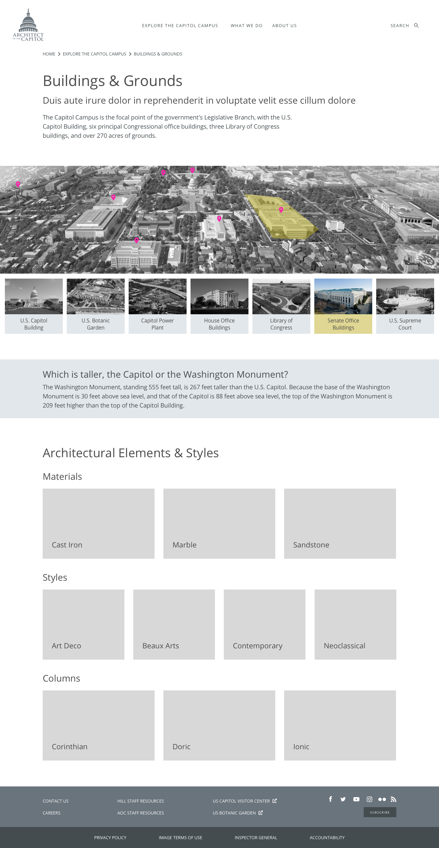
Landing pages were designed to meet organizational goals and user needs for each section. The Buildings & Grounds page invites visitors to explore the map as a way to get to building pages. On the Areas of Expertise page, a blog block introduces serial content related to the work of the AOC. Text is used throughout to educate and engage visitors.
Detail pages
Below, the art detail page lists the artists and location, but does not link to them. Individual paintings are listed and the visitor must click in and out of each one to explore. No related content is surfaced.
At right, the redesigned page. A larger image makes better use of the space. The Basics box gives more details about the piece and links to the artist and location pages. Headings improve readability of the text. The images and captions are available on page. Related blogs and projects are surfaced to keep the visitor engaged and exploring throughout the site.
The site is live. Check it out!


